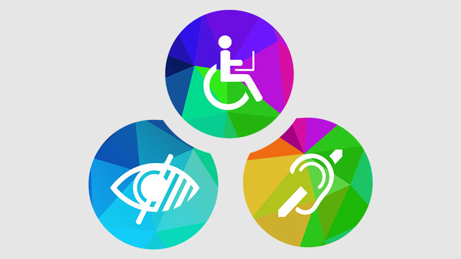
Website accessibility is a relatively new concept, it just recently garnered some hype around it. But, merely as an idea it has always been taken into account when creating a website. Accessibility, in simpler terms, is an indicator of how easy to use your website is. Generally, the segment that was targeted by making things even easier had no real problems without assistive elements anyway.
However, it is becoming more apparent day by day that such an approach is ill-advised not only from an ethical perspective, but from a detached, pragmatic one as well. Integrating some assistive elements will help you not only with regard to the people who will now be able to actually use your website, but in terms of SEO as well. Google pays a lot of attention towards these criteria when trying to rank you website. Taking that into account, especially in Georgia, will by and large give you a huge advantage over your competitors.
Using links, pictures & colors
One such criterium measures how you use your links. Phrases like "read more" or "see here" cause your bounce rate to go up, which negatively impacts your SEO. The bounce rate measures the percentage of users that leave one of your webpages without using any CTAs. The user should understand what you are linking them or at least get the general gist, otherwise they will leave which will negatively affect the ranking of your website.
As for the pictures you use, pay attention to the following: the format style (what type of file you are using), the size and quality (too detailed and you are slowing the website down, too small and you are ruining the design), alt tags which could be used to contain keywords/phrases (they must describe the picture, otherwise they should point out that its decorative).
As for the colors, make sure not to utilize colors that create a stark contrast. For example, a black background and a white font is an eyesore that will annoy most of the users. In general, avoid throwing in too many bright colors together. If you have your heart set on doing just that make sure the design payoff is worth it. 
Navigation, Forms & CTAs
Navigation is the most important part of your websites structure. The smoother the navigation the easier it is for you to keep the user engaged, or have them check out your content, etc. The rest of the content needs to be well put-together not only in terms of its own self but with regard to the navigation as well. For example you may pick out a perfect picture in terms of its format, size, appeal but you might use it in the wrong place as far as navigation is concerned.
The same applies to forms you ask the user to fill out; they need to know what exactly they are supposed to write and how. Additionally, make sure that the space itself is appropriate. If more than a hundred words are needed then they need to see the entire text without having to scroll much, or at all.
Take some time to think how you are going to organize the CTA buttons. I.e the buttons that the visitors use on your pages to do specific things. Depending on what type of business you have got, what style of navigation you are using, whether you are offering services/products and if the visitor is ready to purchase something once on your site you are going to have to vary your approach at least a little bit. 
Frequent Testing
Testing different parts of your site is vital for its anatomical stability. What kind of tests you carry out should probably be determined by what kind of business you have and what you are looking to get out of your web pages. We offer you several standard variations.
Users that use assistive technology generally depend entirely on keyboards. You can test yourself whether it is possible to navigate your site with just a keyboard. If you can use links, change pages, go through content without a mouse.
Naturally, in the year 2022 just about any website should be tested on phones. That goes without saying.
Speed and navigation test are also crucial, especially the latter. Since it will help you notice problems that you cannot, given your experience.


 GE
GE EN
EN