The color trends of mobile app design are changing every year, which is why we often see standardized color schemes that are found simultaneously in different apps.
It is vital to pay attention to the colors you choose for the design of the app as they can affect people’s mood, behavior and stress levels, hence colors can both fascinate your users as well as leave irrelevant impressions.
This article will give you tips to help you choose the right colors for your mobile app design + visual inspirations.
Choose a color that reflects the corresponding emotions.
We associate specific colors with certain emotions. For most people, blue corresponds to trust, security and reliability. Red is associated with speed, energy and urgency. Orange gives pleasure to fun and action, while yellow gives optimism and attention. Black indicates a high-tech, sleek design, while pink is feminine. Green, not surprisingly, means wealth.
Check out the colors used by your competitors
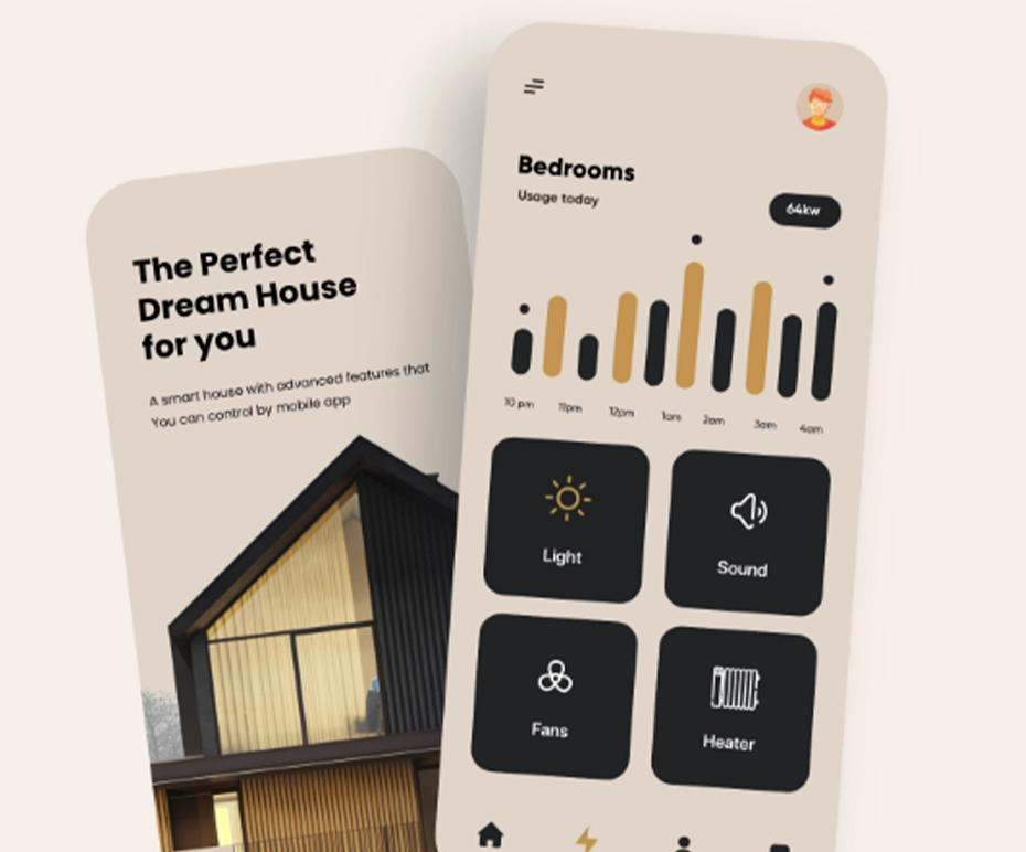
The design of the mobile application is not evaluated only by the design of the icons or buttons used in it. The main thing is to combine all the details and colors. With a well-chosen color palette, it will be good if you add neuromorphic details.
Add a fourth C. of mobile app design.
The 3-C rule of design consists of consistency, clarity, and content. When choosing a color (fourth C), keep in mind that they support content and functionality. In visual interface design, think about color schemes, interaction design, system design, and service design. Include selected color templates in user behavior and flow. Consider the interaction of interface elements and how the application works in the ecosystem of the brand, product and website.
Start from the basics
Yes, this applies to the UI hierarchy, primary and secondary colors, surface, wallpaper, and communication with your chosen color.
Do not be afraid to break the rules.
Googles new app icons have come under fire for their uncertainty. Whether or not this criticism is valid, the company has probably conducted sufficient testing and has good reasons to choose a similar color scheme.
Even if he breaks the rules for less color and definition, he still remains true to consistency. Maybe Googles goal was to maintain the visibility of the users screen or to strengthen the brand. Googles example, we see that this has paid off and it has lots of loyal users. When you decide to break the rules, do it for a good reason and the trend setting is always solid.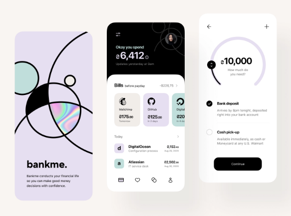


 GE
GE EN
EN