
Web design is both an art and a science. No matter how talented you are and no matter how developed your creative skills are in this area, there are principles that are not worth putting aside.
An example of all this is Snapchat. After developing the redesign, this company had a lot of problems with user comfort, precisely because these principles were violated. For example, it is important to select the CTA buttons accurately (and not, word for word, color them); It is also necessary to follow certain rules so as not to create identical problems.
Of course there are many design principles that are worth considering however we offer 4 principles that we think are particularly important.
Principle # 1: Fit Law
In simple language, Fits law tells us that the time it takes to get an arrow to the required location is the distance divided by the size of the required location. Consequently a small target at a great distance is undesirable. Conversely, a large target is a good practice for a short distance.
If you can not increase the size of your elements then try your best to reduce the distance required for the arrow to pass.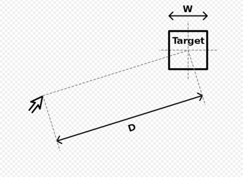
Principle # 2: The Law of Neural Adaptation
CTA colors are quite a controversial topic in the web design world; Some people think that red is superficial for them, some people prefer blue, some people prefer orange. However better when you understand the law of neural adaptation you will no longer pay attention to it.
In short, this law tells us that for a long time the perception of a certain style causes it to be blocked / neglected in the mind. Which naturally works for you - as a designer. For example, if your big sales page is full of black color scheme, doing CTA in black is not a smart decision either. Naturally the user gets used to the color and the CTA no longer catches the eye, hence it is ignored.
The solution is also simple Try to create a strong contrast between the key elements and the CTA.
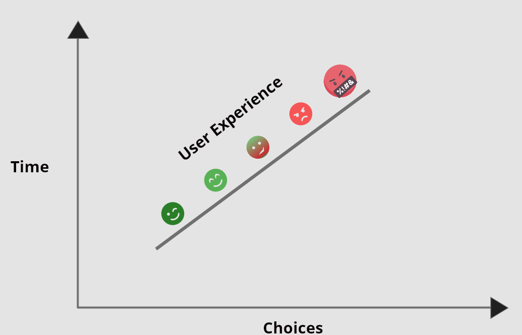
Principle # 3: Hicks law
The name of this law comes from William Edmund Hickey, and Hickeys law tells us that the time a user spends to make a certain decision is directly proportional to the number of options offered. Consequently, the increase in options leads to an increase in time as well.
This sounds a bit vague though you can look at the following facts to better understand the meaning of this law:


 GE
GE EN
EN