
Graphic design is more than just making things look pretty. It is about communicating effectively with your audience and creating a visual impact. To achieve this, you need to follow some basic principles of graphic design.
In this blog we will concentrate more on the visual communication side than the various principles that have an impact on how your website comes across. If you are interested in the latter sort of stuff we have already offered you two different blogs on the topic (1, 2).
As for the visual communication side of things, the first step is to define the goal and the audience of your design project. What are you trying to achieve with your design? Who are you trying to reach? These questions will guide you in choosing the right visual elements for your design.
Colors, typography & imagery
One of the most important visual elements is color. Color can influence the mood and emotion of your audience, and can also create contrast and emphasis. You need to choose colors that suit the context and the message of your design. For instance, if you are designing something for a toy store, you might want to use bright, cheerful colors that attract attention and convey fun. But if you are designing stuff for a bank, you might want to use more subdued, professional colors that convey trust and reliability.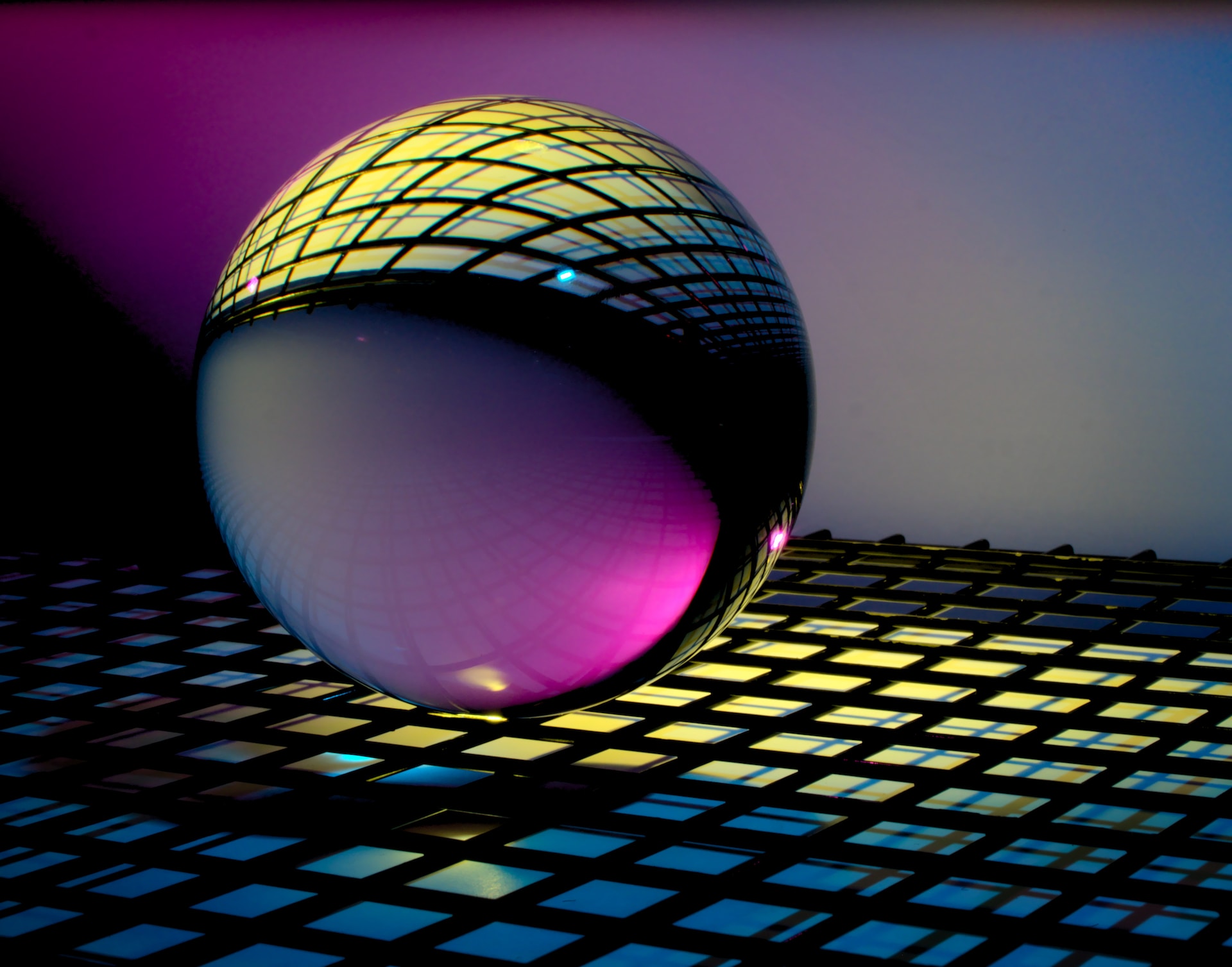
If you want your graphic design to pop, you need to play with contrast. Really pay attention to much things stand out from each other in your design. Through contrast you can spice up your design and show what is important.
You should also balance your design like a tightrope walker. How you spread things out in your design, and how you use symmetry, asymmetry, or radial balance can go a long way.
Another key visual element is typography. Typography is the art of arranging text in a way that is readable and appealing. You need to choose a font that matches the tone and style of your design, and also consider the size, spacing, and alignment of the text. You want to make sure that the text is easy to read and understand, while also creating a visual harmony with the rest of the design.
There is also imagery, which refers to any visual representation that supports your message, such as photos, illustrations, or icons. You need to choose imagery that is relevant and engaging for your audience, and that complements your color and typography choices. You want to use imagery that enhances your message, not distracts from it.
Here is an incredibly simple tip: if you want something to stand out make it huge, if you want something to be glossed over make it small. Size is easy to notice. Sounds trivial right? Now, how many websites have you seen with bloated sections which are completely irrelevant to you?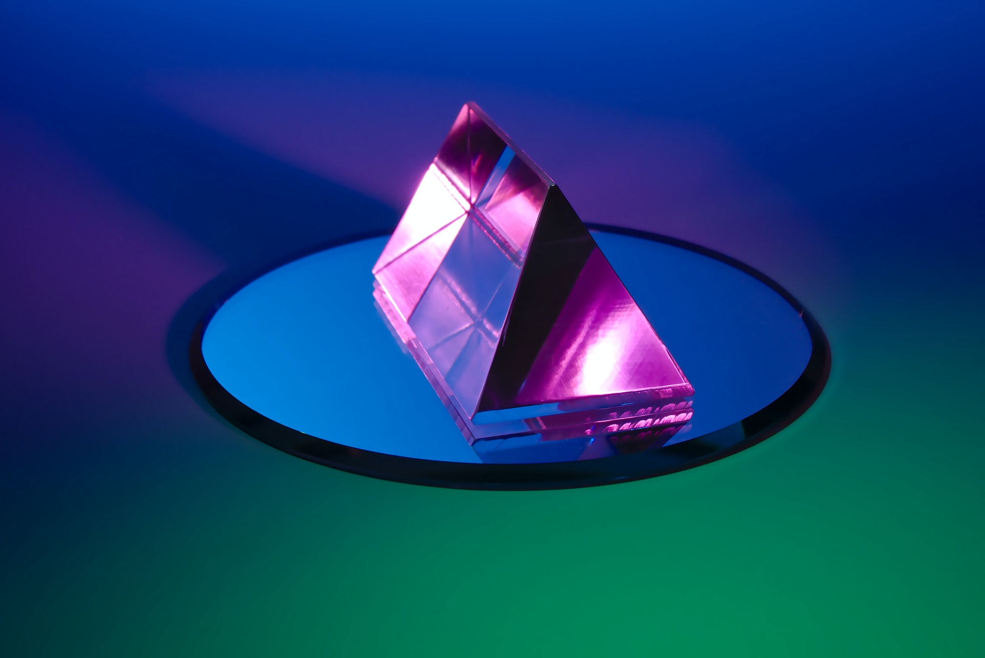
To top it off, all of the advice in this section makes sense if you manage to coalesce all of the above into a coherent whole. That might require practical judgement, depending on how complex your goals or your website are. Therefore, even if you have to significantly sacrifice on some of this for the betterment of your product, you should not even think twice before going through with the decision. Remember, what matters is how the website comes across to the users, not how elaborate it is.
Structural elements
If you want to represent your content in a coherent way, you need to think about hierarchy. Hierarchy signifies how you arrange things in your design to show how important they are. Which is made possible by changing the size, color, and position of things. This helps the viewer see what you want them to see and what matters most.
One more important thing to remember is to be consistent in your design. Consistency can make your design look neat and professional. It can also help the viewers eye and help them find their way through the design. You can be consistent by creating patterns through the use of the same typography, color schemes, and layout.
Another thing you need to think about is whitespace. Whitespace is the empty space around things in your design. It can make your design look nice and balanced. You can use whitespace smartly to lead the viewers eye and make your design more appealing and effective.
Besides these things, you should also think about the general layout and structure of your the web page itself. A good layout can help you guide the visitor to the sections you may deem most relevant. You can use grids, columns, and other tools to do this.
Context & testing
You should think about the context of your design. How will people see it alongside other elements? Will it be on a an app, a website, or a mobile device? Knowing the context of your design can help you choose the right size, resolution, and other technical stuff for your design.
When you design for a specific audience, you need to think about what makes them tick. For example, some colors or symbols might mean different things in different cultures, and you do not want to use anything that could be a turn-off or a faux pas.
Finally, you need to test your design and get feedback from others. This can help you find any glitches or ways to make it better, and make sure your design speaks to your audience. You can do user testing or focus groups to get feedback and tweak your design as needed.


 GE
GE EN
EN