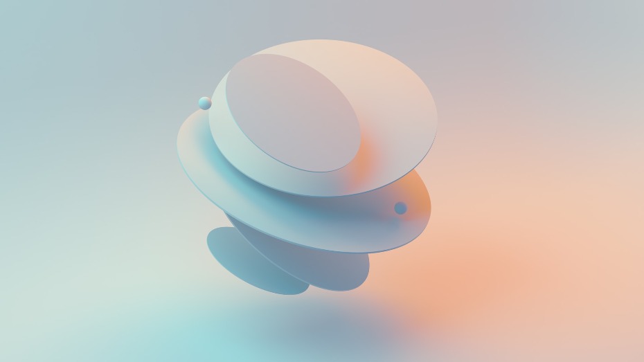
Lately, the concept of minimalist web design has gained more and more prominence. Stripping away the excess and focusing on simplicity not only enhances aesthetics but also improves user experience. We have touched a bit on the topic previously, but there is much more to be said; as such, we are continuing the series. So, lets dive into a practical guide on how to embrace minimalism in web design.
1. Content
Minimalism in web design boils down to one fundamental principle – keeping the spotlight on your content. Users visit a website for information, so it makes sense to present it in a clean, uncluttered manner. By eliminating unnecessary distractions, you ensure that visitors can easily engage with what matters most – your content.
Besides, if your content is at the center of their attention, they are less likely to pay any to other parts of your website. Which means your website will come across as more minimalistic, simply because of the way it is built up. 
2. Usability
Minimalism is not about removing everything; it is about being intentional with what you keep. Identify elements that serve a clear purpose. Navigation buttons are a prime example – they facilitate movement across your site. While unnecessary frills might seem appealing, sticking to essentials maintains a clean and functional design.
Focus on navigation and content, these two will help you understand which elements are the more important ones on the various web pages that you have got. Generally, you can use counterfactuals to test whether something seems decent enough to keep: try to think what sort of disadvantages the site would suffer is this or that element was not on there.
3. Navigation
Imagine navigating a website as a journey, i.e., you visited it for some x reason and whatever stands between you and x is the journey. A minimalist design ensures this journey is straightforward and hassle-free. No matter how visually stunning your minimalist masterpiece is, if it is difficult to navigate, it has lost its purpose. 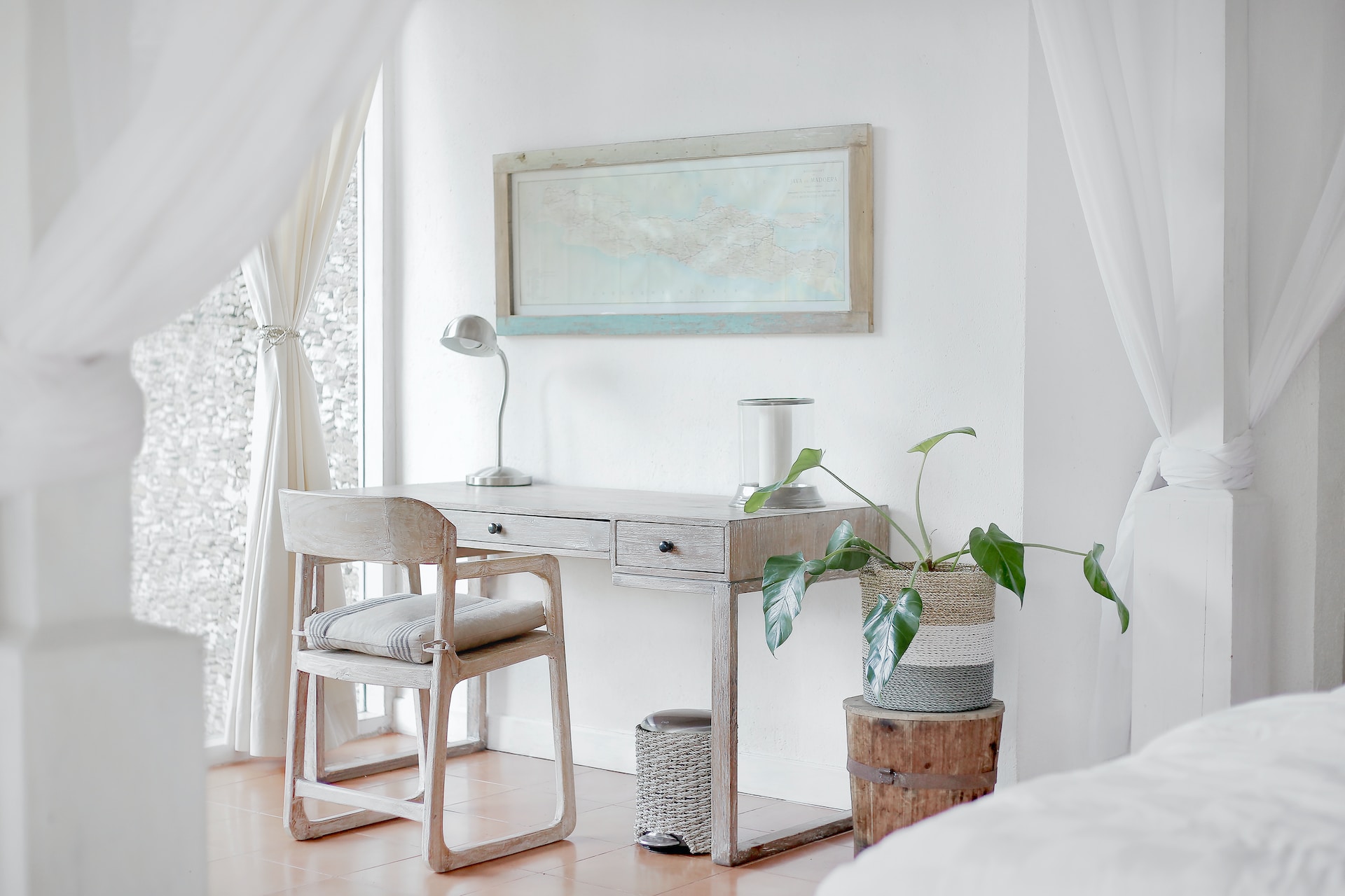
Prioritize simplicity in your navigation structure. Users should effortlessly find their way around, and complex pathways should be avoided. Think of it as providing clear signposts for a smooth ride.
4. Structure
Structuring your content does not mean adding complex layers. Just pay attention to presenting information in a way that makes sense to your potential visitors.
Minimalism in layout is akin to organizing a neat and tidy workspace. Users appreciate symmetry and patterns that guide them intuitively through your content. Keep it simple, organized, and easy to comprehend. The less someone has to think to navigate your website, the better, as a rule. Clear menus, intuitive buttons, and links take the guesswork out of finding what they need.

5. Balance
Do not strip away elements recklessly. Focus on retaining those that add genuine value. Stripping everything down to bare bones might scream minimalist, but it can also render your website sterile and impersonal. The key lies in understanding that minimalism is not about ruthless subtraction, but about intentional addition. Each element on your website, from the smallest button to the hero image, should earn its place by contributing to a clear and valuable user experience.
Imagine your website as a conversation. What is the main message you want to convey? What actions do you want users to take? Once you have those answers, prioritize content and features that directly support your goals.


 GE
GE EN
EN