
If you want to convert your website visitors into customers, you need to have effective calls to action (CTAs) on your pages. A CTA is a button, link, or text that prompts the user to take a specific action, like signing up for a newsletter, downloading a free ebook, or buying a product.
Obviously not all CTAs are created equal. Some are more persuasive and engaging than others, and some can actually hurt your conversion rates. In this blog post, we will share with you some of the most common CTA mistakes and how to avoid them.
1. Planning
One of the biggest mistakes you can make with your CTAs is to add them as an afterthought, without considering how they fit into the overall layout and design of your page. The result will be CTAs that are poorly placed, hard to find, or inconsistent with the rest of the page.
You need to plan your CTAs before you even start designing your page. Think about what action you want your users to take, and where on the page it makes sense to ask them to do it. E.g., if you want them to sign up for a free trial, you might want to place a CTA above the fold, where they can see it right away. If you want them to read more about your features, you might want to place a CTA at the end of each section, where they can click to learn more.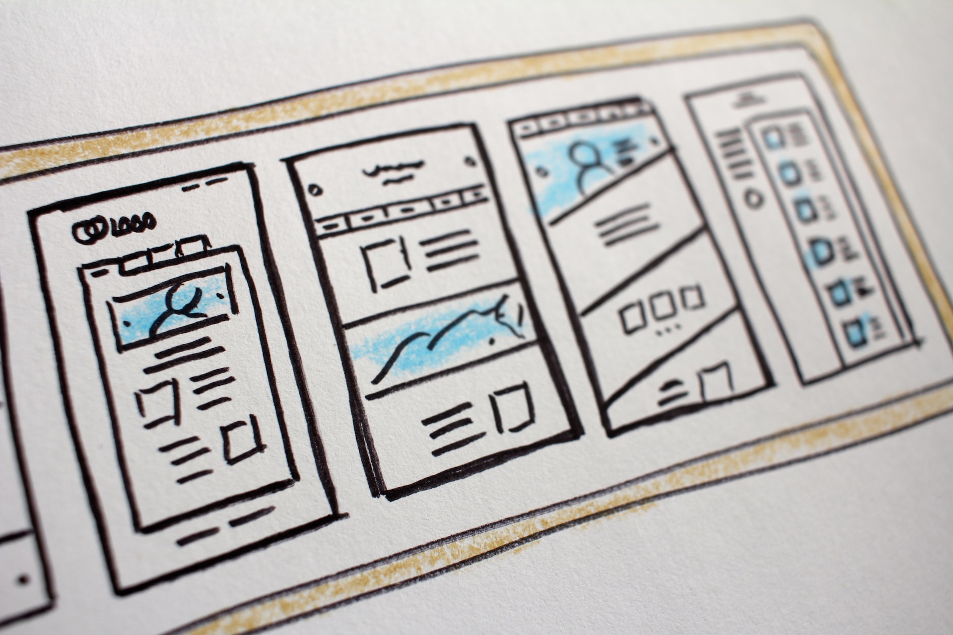
2. Context
Another common mistake with CTAs is to assume that all your users are at the same stage of awareness and interest in your product or service. Which can lead to CTAs that are either too aggressive or too passive, depending on how familiar your users are with your offer.
Which is why you need to segment your audience and tailor your CTAs accordingly. Say, if your users already know your product and are ready to buy, you need to place your CTAs earlier on the page and use strong words like "Buy Now" or "Get Started". If your users are new to your product and need more information, you need to place your CTAs later on the page and use softer words like "Learn More" or "See How It Works".
3. Too Many CTAs
A third common mistake with CTAs is to overload your page with too many of them, hoping that one of them will catch the users attention. This can have the opposite effect, as it leads to confusion and easily overwhelms the user, making them less likely to click on any of them.
Focus on one primary goal. For example, if your goal is to get users to sign up for a free trial, you do not need to also ask them to follow you on social media, subscribe to your blog, or watch a video. Instead, you should have one main CTA that asks them to sign up for a free trial, and maybe one secondary CTA that offers them some free stuff as an incentive.
4. Being Vague
A fourth common mistake with CTAs is to use vague or generic button labels that do not tell the user what they are getting or what they are expected to do. Using words like "Submit", "Click Here", or "Continue" can make the user wonder what will happen next, or what they are agreeing to.
You can hint at the function of a given CTA by adjusting the text to implicitly or explicitly mention it. That way the CTA can itself be on the concise side, while the context adds additional info. 
5. Visual Cues
A fifth common mistake with CTAs is to use a color, shape, or size that does not stand out from the rest of the page. This is prone to result in the CTA blending in with the background or the other elements on the page, making it harder for the user to notice it or click on it.
Use a prominent visual cue that draws attention to your CTA and makes it easy for the user to spot it. E.g., you can use a color that contrasts with the rest of the page and that you only use for primary CTAs. You can also use a shape that is different from the other elements on the page, such as a circle or an arrow. Or, you can also use a size that is larger than the other elements on the page, but not too large that it looks disproportionate or intrusive.


 GE
GE EN
EN